Thursday, August 14, 2008

Study: Email is cheap and we like it

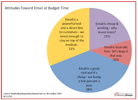
This week's Marketing Sherpa Chart of the Week highlights marketing spend allocated towards email.

Here's the chart, taken from the organization's Benchmark Survey:

A takeaway from the above is that just as many people said email is cheap or free and fine as it is as did those who find it to be a powerful tool that's worth spending enough on to stay on top of it.

Yes, email is an inexpensive marketing tool, but I think the "junk-in, junk-out" rule applies here.  Companies will only get so much out of their email programs if they don't allocate proper resources towards them.  MailChimp blogged about a company that notched a $157,000 ROI from its email campaign.  (OK, this company deals in precious metals, but still.)

It is my hope that the 31% group grows and more companies begin to realize the power that the channel carries.  As the market for mobile messaging grows, I see email as a complementary channel growing alongside it.

Tuesday, August 12, 2008

E-m-a-i-l: Email, email, email!

No sooner did I write about the importance of combining text with images in email design did I come across this email from the New York Jets:

It's lovely to look at, but it goes against everything I believe in as far as email design is concerned. I'll give the team credit for blasting this message at 4 a.m., mere hours after the deal to acquire QB Brett Favre transpired. But I wonder how many Jets fans, before they've had their morning coffee, opened up their email to find something that appeared as jibberish to them. This could have been how some even learned that their beloved Gang Green was now home to the former Green Bay signal caller!

I know, more questions than answers here. But another example of how something rushed into the pipeline could have resulted in some missed opportunities.

Monday, August 11, 2008

Email design: The good, bad and ugly

Lately I’ve been getting a lot of HTML-only emails. My settings, like those of most people, have images turned off.

In fact, here’s a quote from a Marketing Sherpa study:

MarketingSherpa data indicates that 59% of consumers and 90% of business email users view some or all of their email with images turned off. This includes people who may view email in their preview panels with images turned off (remember, this is the default for many email clients including Gmail and some versions of Outlook). It also includes people who view their email on a mobile device, such as a BlackBerry.

(This matches past posts here and here about the need to consider viewing email on PDAs.)

With many in planning mode for their Q4 holiday email campaigns, I wanted to show the good, the bad and the ugly of email design. It may have been chic at one time to put form ahead of function, but nowadays, good marketers know that improper planning and design can be costly. Style no longer trumps substance, but they still should complement each other.

Here’s the ugly message that I receive from Fifth Group Restaurants on a weekly basis. (Click the links to view the examples.) With images turn off and images turned on. If I didn’t display the images, I’d have NO idea what their message was trying to convey. (You only get so much from a subject line.)

Here’s a bad example. Images off (as it first appeared in my inbox) and after I turned the images on. There’s some information in the alt-tags, but darned if I get anything meaningful from it. Shame on them for putting the text into image format.

The winner (in my inbox) comes from Upromise. Even with the images turned off, I get the gist of their message. Turning them on complements the text. They still have a top navbar either way.

Here’s a quick and dirty list of things to think about and best practices (it’s by no means complete):

  • KISS – Keep it simple, stupid. Don’t pack too many bells and whistles into an HTML email
  • Use alt tags and support text around images. If a reader’s setting have turned off images, they’ll still get the essence of your message
  • If manually coding your message, lay it out with tables
  • If you’re not going the Design DIY route, use an email service provider with existing templates
  • Test, test, test

And here’s a list from Feb. 2007 that lists the default setting for images for most of the major email clients.
Friday, August 08, 2008

(Belated) Meet-up recap

I have been terribly remiss in posting a follow-up to an earlier post that mentioned I'd be speaking at an Atlanta Web Entrepreneurs Meet-up last month. For a full review of the event, here's a recap by Ben Chesnut of MailChimp, who was also a speaker. His take is much wittier than anything I could put together. Again, I want to thank Mike Schinkel for the invitation to speak and for documenting the event. (That's one of his photos at the right, taken from his Flickr set.)

I also wanted to link to the presentation I gave at the event. It's uploaded to Slideshare, which is a great way for sharing slide decks. I titled it "Email 101" since it's pretty much an overview of things to consider when beginning an email marketing program. Another similar site for sharing PowerPoint presentations is 280 Slides, which I learned about from Ben at the Meet-up event. It is not a requirement that your deck have 280 slides, by the way.

Thursday, August 07, 2008

What is this blog about?

I'd say this is pretty accurate - email, marketing, Atlanta-based, communication on different platforms.

This was created by wordle.net. I just plugged in this blog's URL and presto.